
Learning From Sales Data — Data Analysis Project
This project demonstrates how a realistic micro‑business sales dataset can be analysed to reveal clear, practical insights. Showing the next steps after cleaning: turning structured data into meaningful understanding that supports decision‑making.
Scenario
A small independent homeware shop wanted to understand what their sales data was really showing — which products performed best, how customers behaved, and where they could improve stock decisions. Their data lived in spreadsheets and monthly notes, but nothing was joined up or easy to interpret.
I cleaned the data lightly, structured it, and built a clear Power BI dashboard to reveal the patterns behind everyday sales.
Before → After
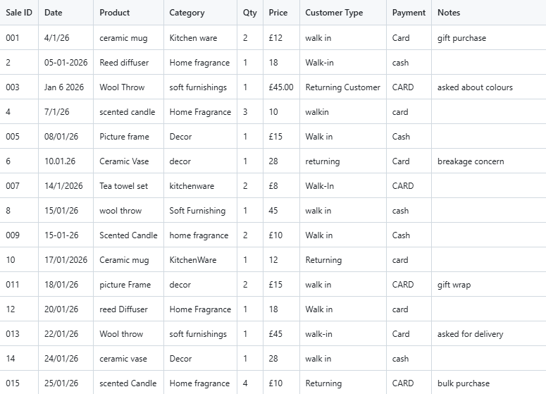
Raw dataset:
The dataset included:
inconsistent product names
mixed date formats
varied category labels
untidy notes
small structural issues
It was usable, but not analysis‑ready.
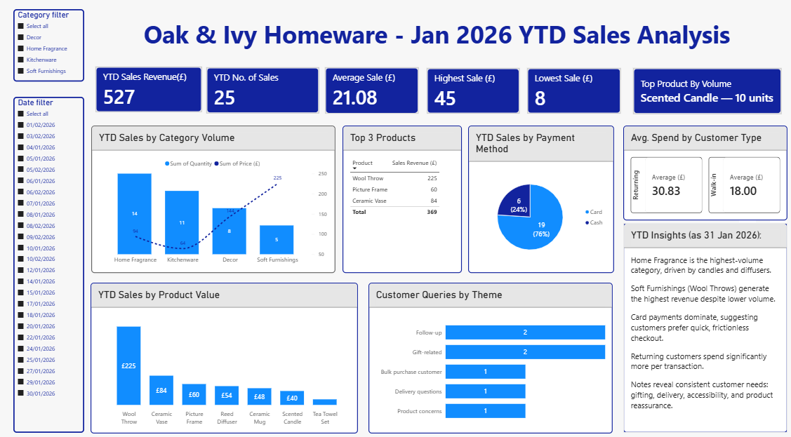
Dashboard Overview:
The dashboard includes:
YTD revenue, volume, averages
Category performance
Top products
Payment method breakdown
Customer type comparison
Notes themes
Clear, simple visuals designed for small‑team decision‑making
What I Did
Cleaned and organised the raw data
Structured the dataset for analysis
Built a Power BI dashboard
Created clear KPIs (revenue, volume, averages)
Highlighted top products by revenue and volume
Analysed customer behaviour (walk‑in vs returning)
Summarised payment method patterns
Extracted themes from customer notes
Designed clean visuals for quick decision‑making
Key Insights
Soft Furnishings generated the highest revenue, driven by consistent sales of wool throws.
Home Fragrance had the highest volume, especially scented candles and diffusers.
Returning customers spent significantly more per transaction than walk‑ins.
Card payments dominated, suggesting customers prefer quick, frictionless checkout.
Notes revealed recurring themes: gift wrap requests, delivery questions, accessibility needs, and reassurance about products.
Why This Matters
Once analysed, the dataset becomes genuinely useful. Oak & Ivy can now:
plan stock more accurately
understand customer behaviour
identify high‑value products
improve customer experience
make clearer decisions based on real patterns
Clear analysis supports clearer thinking.
Typical outcomes
Dashboards that show what matters at a glance
Monthly reporting that takes minutes, not hours
Better understanding of customer behaviour
Confident stock planning
Decisions based on real data, not guesswork
GitHub Link
View the full project on GitHub: https://github.com/Dawn-ThinkCave/sales_data_analysis